The Weird Wide Web
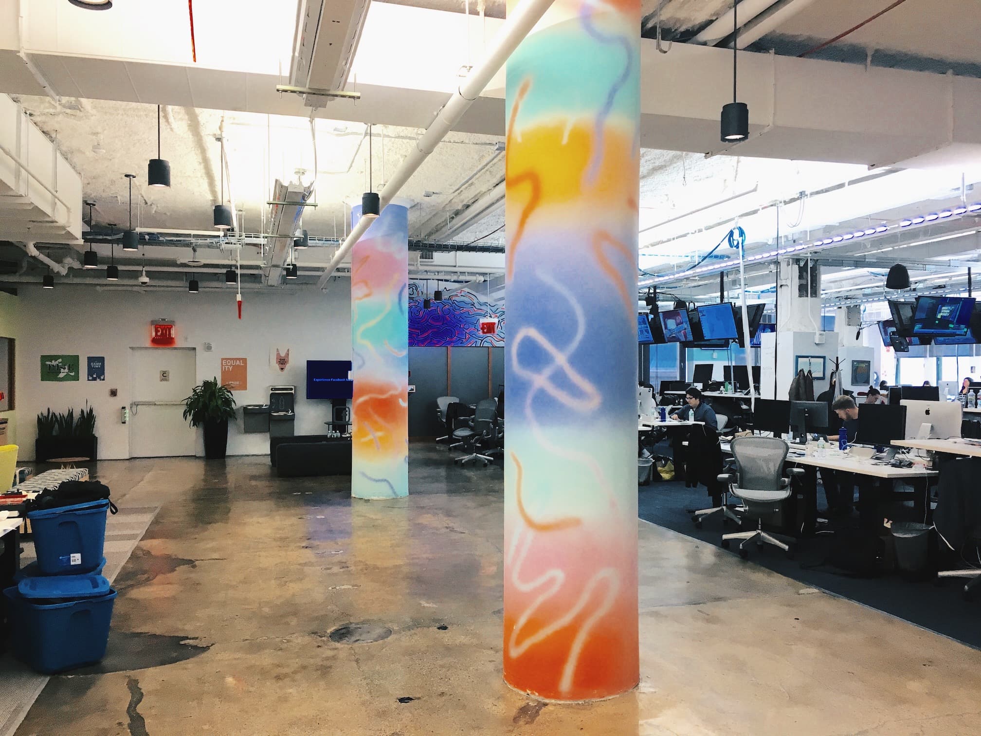
From my “hotel desk” in Meta’s New York office, I can see a handful of different environments. A cluster of soft chairs for people to sit & work situated on a grass-green carpet; a kitchen with chipboard walls and dozens of coffee samovars, empty for the third time in two hours; and a forest of white pillars bordering the desk space for this floor’s employees. But right by the elevators, two of these columns are garishly different—painted from floor to ceiling in a Love Hearts-inspired gradient of pastel colors, with interjections of clashing spray-paint scribbles.
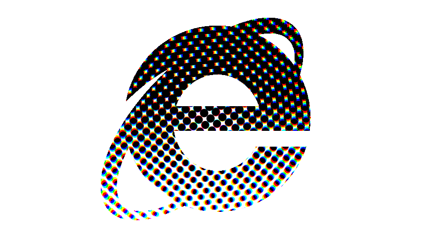
The juxtaposing style predates a similar style which is becoming ever-present on the web. It’s just one embodiment of a style known as “brutalist” design. There’s no shortage of commentary on the trend floating around, but as its prevalence1 continues, it becomes an increasingly interesting statement of our place as designers for screens.
Popular opinion is that brutalist web design emerged in response to the dominant aesthetic of web design over the last half a decade; plainly-made websites with white backgrounds and black text2. If this conventional aesthetic web design is Helvetica, brutalist web design is the web’s David Carson moment. Web design—just like traditional graphic design before it, with oscillation between Swiss design and “grunge” typography—is seeing a pendulum-like shift back to the high-gloss ornamentation we saw with “Web 2.0”, and pushing it beyond comfort. It serves as both an embrace and a gigantic “fuck you” to the skeuomorphic design of yesteryear. “Purposefully broken and ugly” is the rallying cry of brutalist web design.
But what’s interesting to me about the efforts of the designers embracing this style is that they’re simply employing tools that have otherwise never existed. Web technology has come some way in the last few years, adding CSS transformations and filters, native 3D rendering in browsers, and function beyond styling, with access to device information, such as its orientation in 3D space. Not only do web designers have access to tools and styles that traditional graphic designers have known for years—layer-blending and (somewhat) direct manipulation of layers—but we have immediate access to these techniques. With a Google search here and there, and a few lines of code, we can produce 3D models with complex colors and shading, drop that into a previously bland and unremarkable design, and completely change the experience of a website. Not only that, but we can make it interactive, too, changing in reaction to the viewer’s location, device, or interactions.
Whether these brutalist websites are trend-hopping or pure experimentation and originality is besides the point; it’s extremely fun, and extremely easy. Web designers and the Photoshop-toting designers of the early 2000’s used to ponder about the “happy accidents” that traditional graphic design so often embraced. Now, with new technologies, these accidents are mere keystrokes away. As our tools become more powerful and abundant with features, it becomes increasingly easy to happen upon one of these happy accidents. What used to be experiments with new CSS features are becoming the portfolio pieces of designers settling into a confusing and young medium. Whatever the web’s grain looks like, brutalist web design might be the fastest way to discover it.
There is, of course, a hugely self-serving characteristic of brutalist design. Brands like Bloomberg exemplify it; a household name embracing a trend and diverging from utilitarian convention might be good for enthusiastic designers, but does the core readership suffer as a result? Do the same people reading about stock prices and big business buyouts understand the subtle humor in a design that throws garish gradients over Tim Cook’s face? While designers are immersing themselves in the weird web and this new, broken aesthetic, are we able to evaluate the lessons we learn?
If we aren’t learning anything from these experiments—and I suspect that’s possible in a lot of cases—I still think that’s ok. The web is going through some growing pains. Designing for the screen is different today than it was five years ago, or even one year ago. We have to start worrying about immersive virtual and augmented realities; we have to start worrying about screens that can twist and bend and tear; we have to start worrying about a world with no visual interfaces at all. It seems like preparing for those worlds means throwing out the rulebook, making web and digital design a spectator sport, and waiting to see what emerges as the victor.