Where We Can Go
I’ve been working on design systems for around 5 years: almost as long as the term has existed. At least, in the way we employ it today.
Even before “design systems” was a Thing, I’ve always found myself drawn to hobbies that exhibit some of the same qualities of systems.
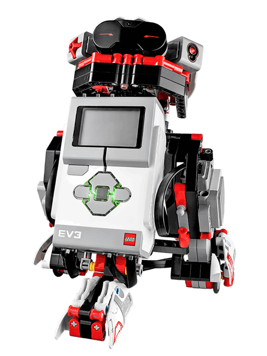
When I was a kid, I loved Lego Mindstorms. The model pictured is a lot more sophisticated than what I had as a child, but the concept is the same. The key piece here is the gray brick in the middle; it’s effectively a computer with a motor inside it, which you could plug into a PC and, using something similar to Scratch, you could program it to do different things. By assembling blocks of instructions, you could have it run the motor, which in turn, you might have attached a set of wheels to, and before you know it, you’ve built a robot that can drive around on a tabletop.
My fascination in this didn’t stop at Lego. In Britain when I was growing up, we had this magazine that came out every two weeks called “Real Robots”, and in each issue, you’d get pieces of a robot—the little blue one pictured in the top left corner of the cover.
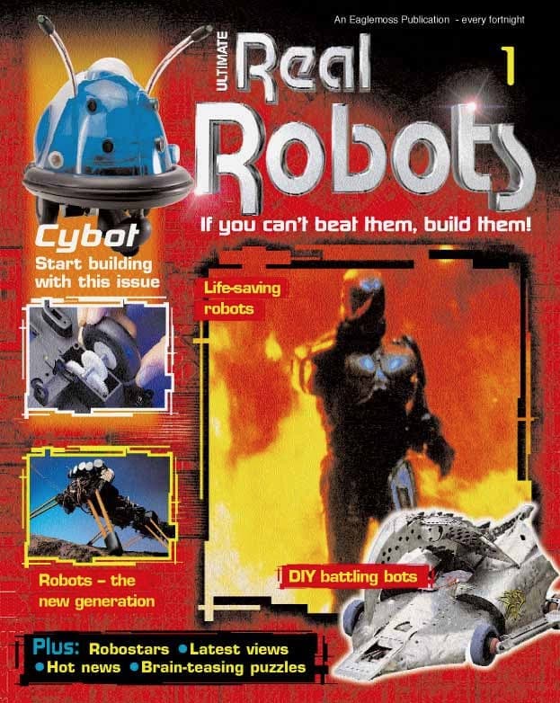
What was really incredible about this magazine is, at the end of its run, when all its subscribers had built their robots, the last couple of issues were chock-full of people sending in pictures of their own creations; people who had taken the same set of components, but made modifications, adding new features or decorations to their robot. It was the first wider community I had really participated in, without even realising it until much later in life.
Now, as an adult, I’ve managed to apply the same desire-to-create to something with a much faster feedback loop: software. In my spare time, I’ve dabbled in generative art: computer-generated art pieces seeded with randomness and based on a few simple rules that I can adjust and observe the results.
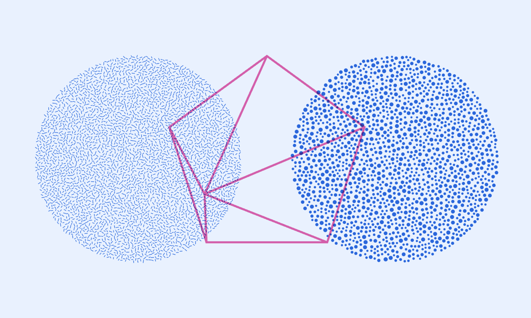
I took particular interest in what happens when you have the same set of rules with only minor adjustments in them. In the piece above, the same algorithm is employed for the circle on the left and on the right: fill this circle with as many smaller circles as possible. The difference between them is how those smaller circles are stylised: on the left, it’s drawing a line across their centers; on the right, it’s filling them.
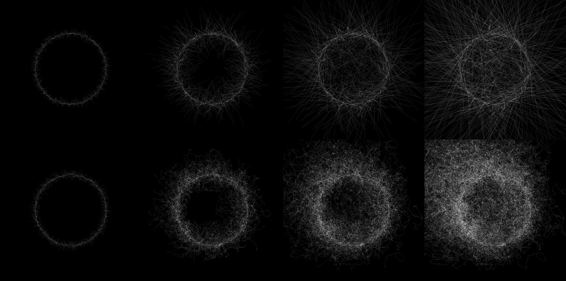
And here again, the same algorithm, with only a minor adjustment in the rules, can have drastically different effects. In the top row, a thousand points along the circumference of a circle are told to move in a linear path. In the bottom row, the same thousand points are told to go on a random walk—pick a direction from left, right, up, or down on each frame, and draw again at that point.
Now, these stories will come back into play a little later on: right now, they have no practical application. To begin our journey I want to first talk about where we came from.
Where We Came From
Like so many others in the field of Design Systems, I owe my excitement and understanding of design systems to the work of a handful of influential people.
Nicole Sullivan opened my eyes to object-oriented CSS and design, popularizing the media object and opening the door to modular objects in front end development. Her work and writing transformed the way I thought about designing and building websites.
Mina Markham, through her work on Pantsuit, the first Design System for a political campaign, showed us all what it means to apply design systems that evolve with brand, in a space where tech investments were still uncommon, and could have an outsized effect on the wider world.
And of course, Jina is responsible not only for helping establish patterns like design tokens, but also for fostering a bustling and amazing community across the globe. It’s thanks to her efforts that we have the design system Slack community, Clarity conference, and numerous Design System Coalitions around the world.

Along with these lessons and inspiring leaders, I owe my being here today to three things. It’s taken equal parts of luck, skill, and privilege for me to be here.
Sometimes, it’s been an outsized amount of luck. I got lucky when a startup in San Francisco took a chance on me after I graduated in England, allowing me to build a life in the US.
And I’ve owed a lot of my success to privilege: the fact I look and sound and identify the way I do—a straight, white, able-bodied man with a British accent—has undoubtedly gotten me further in my career than I would have been otherwise.
But I’m also good at what I do. I’ve worked hard, and sometimes my efforts take more skill than anything else.
I’m sure many of you can relate to this feeling that we have these finite resources of luck, skill, and privilege in stock, and we find them depleting in different ways depending on where in our life we are.
Thanks to those parts, my career in tech started at Dropbox in 2013. I was joining a team of about 8 designers, and a few months into the job, we found out about this new design tool: it was called Sketch.
Sketch was exciting. It was like taking the 5% of Photoshop that we actually used for UI design, making it more streamlined, and throwing out all the rest. And my team was scared to try it.
It represented a big change: we had a lot of work in Photoshop files scattered throughout one massive shared folder.
So I decided to help the only way I knew how: pulling a rug out from the team. I worked with another designer to recreate all our Photoshop templates in Sketch, and then deleted the Photoshop files.
In the end, it only took a couple of weeks for folks to become really proficient—especially with the help of some working sessions together.
I got a real kick from the increased productivity of our team after we made the switch. And I wanted them to feel even more capable in Sketch than they ever did in Photoshop, so I invested a lot of my own time in building a library of our components. I didn’t know it at the time, but I was building a design system.
It wasn’t long before I found myself wanting to design in the browser. I came from a background where I did a lot of my own design work in HTML and CSS, and at this time I was working closely with our engineers and found myself often recreating our design components in CSS to help the engineers build more quickly.
So I spent a hack week recreating our Sketch components in CSS. A year or so later, myself and half a dozen engineers would go on to open-source this work, and drive adoption of it internally. It was called Scooter, and it was Dropbox’s first designated design system.
Through this experience, and throughout my career since, I’ve realized that my passion in my design career boils down to this: Building things for people who build things. I love working with other people, and finding ways to help those people do their best work.
Now, at Meta, things feel a little different. At Dropbox, the problems we aimed to solve with design systems were more about keeping 30-odd designers on the same page, and making sure our product felt like one consistent thing.
At Meta, in comparison, consistency is a hopeful outcome, rather than an explicit goal. The objective is speed and efficiency, and the way we get there is entirely different.
With so many different products, and thousands of engineers and designers, it’s impossible to be enforcers of the system. We can’t prevent people from breaking the system, especially with the many handoffs that happen between different functions and teams. In turn, our role as a systems team turns from that of organizer and enforcer, to that of anthropologist and researcher.
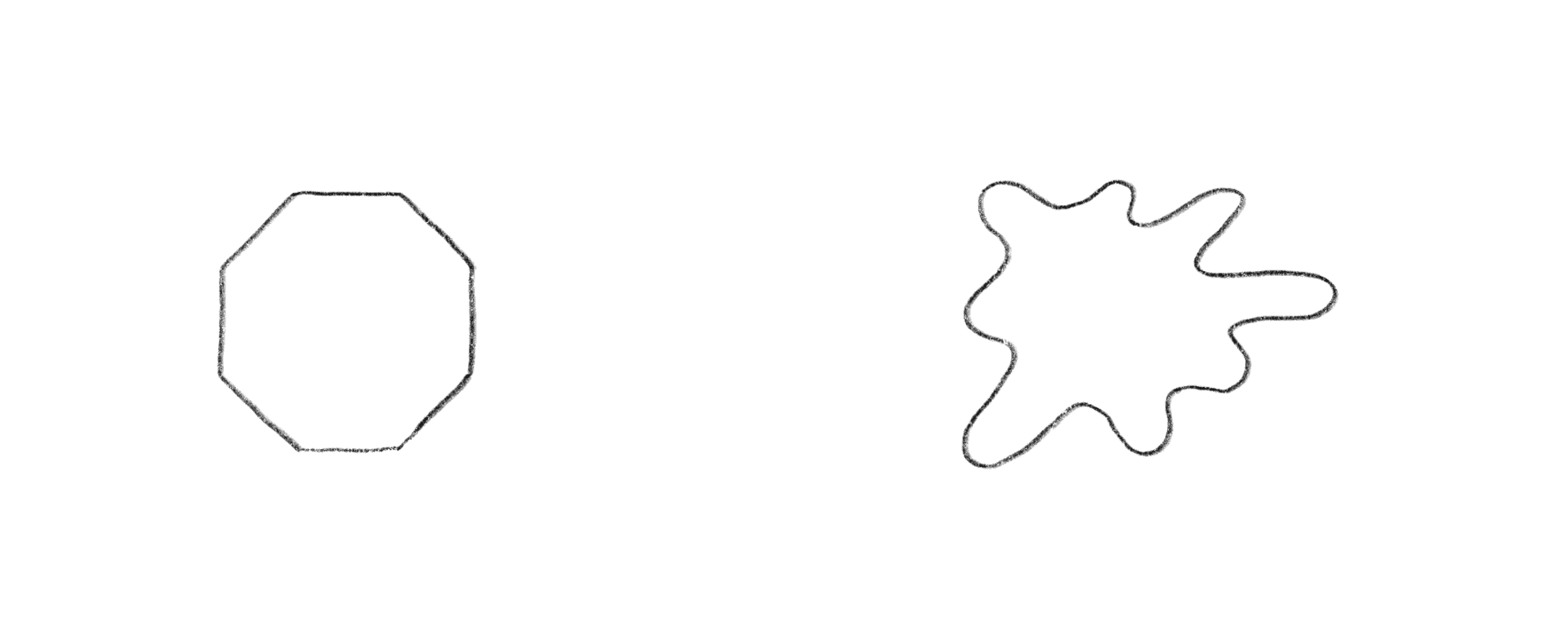
It’s futile for us to expect everyone to use the design system, so instead, we ask: why aren’t people using it? How can we make it more useful? How can we make a system that allows meaningful exploration and divergence from the system? And how can we make those divergences retain the spirit of the system?
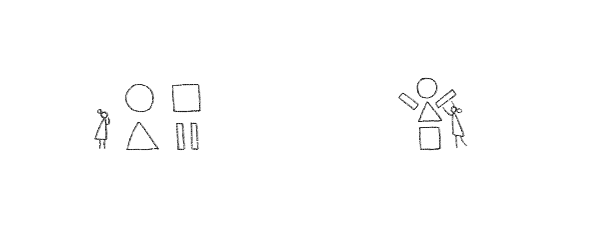
And rather than trying to keep things in a specific order, constantly fighting against the tide, we have to step back and see what form the system takes in the hands of the people we build it for.
That brings me to today. Many of us see the value of design systems. We’re all experiencing the benefits—and difficulties—that they present, and all at different scales. And our collective experience tells us that a design system is many things.
It’s components and patterns; it’s integration with, or development of, tools for product development; it’s resources like research findings; it’s guidance on how to use the system; and it’s support for those cases where the system isn’t working.
But critically, a design system is about people: how they interact, how they understand one another, and how they work together to achieve a common goal. It’s made by people, used by people, and experienced by people. It’s challenged and shaped and broken by people.
And, when you think about it, all those other things—components, resources, guidance, and support—boil down to just two essential categories: People and tools.
This is where I want us to start. This is what we’ll take with us to discover where we can go.
Systems As Tools
I think the first place we can go—taking only tools and people with us—is a repositioning of design systems in relation to the product development cycle.
Today, this is a common illustration of how design systems might be connected to different outputs. You might have a system that’s supported in Sketch and/or Figma, as well as mobile and web code.
This picture is a bit idealistic though.
More commonly, you might actually have slightly varied systems for mobile and web, and those systems themselves are governed by a broader brand system.
Plus, the systems don’t exactly directly output to these platforms or file types: we gesture at the design system in tools. In design tools, we gesture at the system in rectangles and text that aren’t representative of the nature of where they’ll (hopefully) end up.
And in code, we struggle to strike the balance between rigidity and flexibility: how do you develop a component library that’s flexible enough to suit people’s varying needs, while being safely and strictly typed?
Ultimately, the burden falls to partners and product teams to interpret the system in these tools and through various abstractions, passing fragments of their product back and forth between functions, and often shipping something neither fully close to what they wanted, nor fully close to the intended system.
And then they have to do it all again on another platform.
Let’s go back to this diagram. Let’s try to think about how this flow would look if the design system became the tool, rather than an abstract entity that people gestured at using an array of tools.
If the design system itself is the tool, then partners and product teams would directly manipulate the comprising parts of the system, and the outputs and platforms become what they ought to be—implementation details.
In this way, the design system becomes a tool to directly create the product that the team has in mind, and the artifacts—the Sketch and Figma files, the mobile and web code—become side effects.
At Meta when we talk about this problem, we turn to this graph. This is a known problem in traditional product development cycles: there’s a moment in the development cycle where design is somewhat complete, and at a high fidelity, and then a “handoff” happens to actually build the product. What results is often a massive initial drop in fidelity, and a slow crawl back to that level, sometimes not even reaching the same level of quality as originally planned.
If we’re able to create tools that put the design system first and foremost, and potentially even create tools that designers and developers alike can use simultaneously, what happens is that those processes happen together, and the result is of a higher standard of quality.
I have one more note on this idea before we explore its implications. Something we commonly talk about in this industry is how designers “throw their work over the fence” to engineering.
But something we always forget is that this isn’t where the product development cycle ends: where it ends is in the hands of the customer.
This means that designers are even further removed from customers than we tend to acknowledge. We spend so much time “othering” engineers, but ultimately it is engineers that are responsible for what the customer experiences. The work that we do in tools like Figma and Sketch is meaningless to customers: they’re static facades of what they will actually experience on their computers and phones.
If our tools let designers, engineers, and entire product teams work together in tandem, it helps reduce the points of handoff—the number of opportunities for misinterpretation or unintended compromises—resulting in a higher quality in the final product, and an improved experience for the customer.
Reactive Systems
What else changes when the design system itself becomes the tool? I think we can begin to address other problems that systems set out to solve, but tooling—and implementation details—prevent us from being able to. One of those problems is consistency, and to demonstrate what might be possible, I want to talk about a game.
This is a game called Baba is You, and it’s based on rules. In this level, the rules are: Baba is you, flag is win, wall is stop, and rock is push; so to win the game, I just need to push the rock and touch the flag.
You soon find that in order to win the game, you have to change the rules. In this case, wall is stop, and I’m surrounded by wall so… I break that rule, and I have to find a way to win.
The game gets progressively more… creative. This is the same level as the last, except this time, “wall is you” and “flag is stop”. Baba is nowhere to be seen, so I just need to make something on the screen win.
What you soon learn about this game is that it’s highly dependent on logical consistency. I can’t change a rule like “Baba is you” without making something “you”—if there’s no “you,” then… nothing is you. You can’t win the game if you don’t exist.
What I find interesting about Baba is You is how straightforward its system of rules is, and how quickly it becomes complex and difficult. It so well demonstrates how quickly complexity can manifest in a simple world. And it makes me wonder how we can have similar feedback loops in this theoretical tool we outlined earlier.
From experience, I know that designers often make changes to system components—deliberately or not—without realizing their implications. But what if this hypothetical tool could show designers the impact that their decisions had on a system?
What if, when they change the color of a button from blue to purple, they can observe the outsized effect that has on the system: because they’re no longer changing the color of a rectangle, but changing the semantic meaning of a color across a wider system.
Process Over Output
If we interact with systems directly, and we have feedback loops that inform our decisions about changing the system, what else might we lift from in front of us to achieve meaningful product design?
We know that, in this new tool, a meaningful change can be previewed to see its effect on a wider system. But what if you were able to see this change not only as it applies locally to the particular view you’re updating, but to every view—or a sample of every view—that uses that component?
This would imply, in turn, that people can look up existing usages of a component to learn how to use it correctly.
Having a feature whereby someone could grab a component, like a button, and see instances of it throughout a large application, could go a long way towards people understanding the right—or at least most common ways—of using it.
But such a feature could enable more meaningful insights, too.
A tool like that could probably tell us when we’re exposing our users to risk. It could identify when we’re asking users for sensitive data—such as their gender or any personally identifiable information—and ensure we understand the legal and ethical requirements of such asks.
Design systems and tools should take us far beyond no longer having to worry about using the right button or the right font size. Design systems should help us protect our users’ information and prevent dark patterns. They should make ethical solutions easy.
And they should bring people with different skills closer together, more informed, and more involved.
Now that we’re done talking about buttons, we might think the work is over, but there’s so much further we could go.
With sophisticated systems and tooling, we shouldn’t be “handing things off” to content strategists, and then on to legal, and then back to design, and then over to engineering. The design process should seamlessly involve every product development function at every stage. Legal departments should be able to weigh in on questionable patterns before they get beyond a wireframe. Content strategists should be a part of API design discussions. And engineers should be able to offer up their expertise in reuse and modularization at the design ideation stages.
All this is to say that we have a long and growing list of features that design systems and tools should enable for us, but that we’re barely seeing in development today.
Features like automated internationalization, so we can see how our components react to different locales; built-in colorblindness simulation, contrast checking, and consideration for input methods that aren’t touch- or pointer-based; content strategy tooling, allowing writers to easily test different strings in usability studies and at scale; embedded research findings, colocated with components and patterns, so that designers can make informed decisions about how to enumerate a list of objects, or when they should diverge from a standard; and privacy linting, so that product teams know when they’re asking users for sensitive information, how to do so with care, and how to protect the rights and data of their customers.
And you’ll note that none of these features are about rectangles or text, or React or Vue, or a platform or aesthetic. They’re about people.
People
Which brings me to the end of this exploration. I’ve tried to paint a picture—albeit a fuzzy one—of where I think we can find more effective design processes; but ultimately, no matter what path we take over the next few years, as design and development tools continue to change, I think we’ll end up in the same place: making better bridges between the people involved in building something.
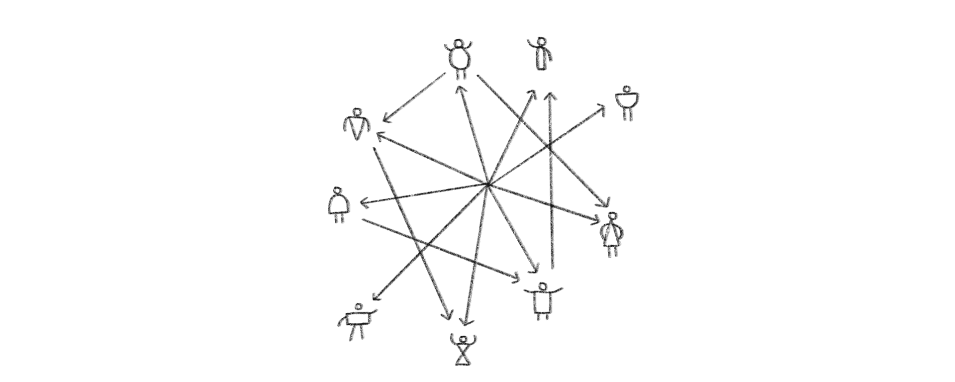
If there’s one thing I’ve learned in years of working on design systems at scale, it’s this: design systems are about people. In our journey, we took tools with us; but any tool today seems to just get in the way. At the core of their essence, design systems are just a proxy for getting people to understand one another, work towards a common goal, in service of people.
In turn, our tools should be about people. We’re starting to get there; we can see multiplayer design workflows and commenting making design innately more collaborative; but our tools still put up a wall between the strengths of designers, and the strengths and resources of other product development team members.
I want our design tools to be as richly interactive as Lego;
with immediate and obvious feedback loops when pieces don’t fit together, and that encourage, rather than prohibit creative ideas
And for them to be as plainspoken and layman-friendly as Scratch; simple enough for anyone to understand how a design solution is arrived at, and see all of its edges at once.
I want our tools to be highly collaborative, and open to entire teams and communities. I want them to encourage the kind of collective co-creation that Denise was illuminating for us yesterday morning, rather than being in the way of co-creation.
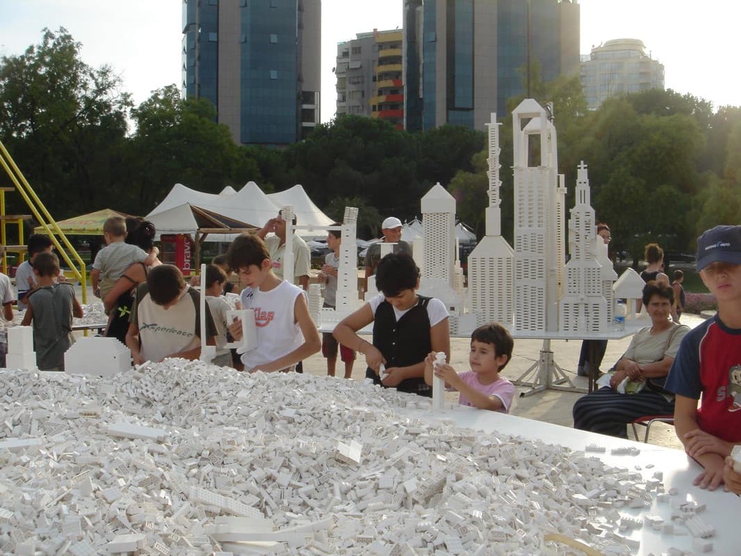
And to put people at the center of all of this, allowing everyone to offer their expertise; that sounds like a sure-fire way for us to build truly amazing things.
I hope, if nothing else, you leave today feeling inspired to work more closely with the people outside your immediate sphere, because truly, that is what makes effective and impactful design. The only way that we can go far anywhere is together; and it’s up to all of us to decide where we can go.