A Tapestry of Tools
When a new designer joins Meta, they go through several days of what’s called “Design Camp”—a series of classes and conversations with seasoned Meta designers about what tools, processes, and approaches we use to design at scale.
For the last year or two, I’ve had the pleasure of presenting a class about our design systems. I try my best to make at least half of the 45-minute session a time for the attendees to ask questions: after all, everyone in each class has different experiences and expectations about design systems.
Almost inevitably, one question comes up more than any other: “What design tool should I use?”
The short, technically-correct answer is to use the tool that our Design Tools and Systems teams support. The longer, more interesting answer is: all of them.
Every design tool offers something different, and it’s important not to think of these differences as making a tool “better” than another. In order to properly understand the answer of “use all design tools”, we have to step back and ask: what are we designing, after all?
What are we designing?
Many digital product designers are familiar with the common misconception that our job is to make things look good. We know that really, a designer’s job is to make things work well. But it’s also extremely common for our output to be primarily visual.
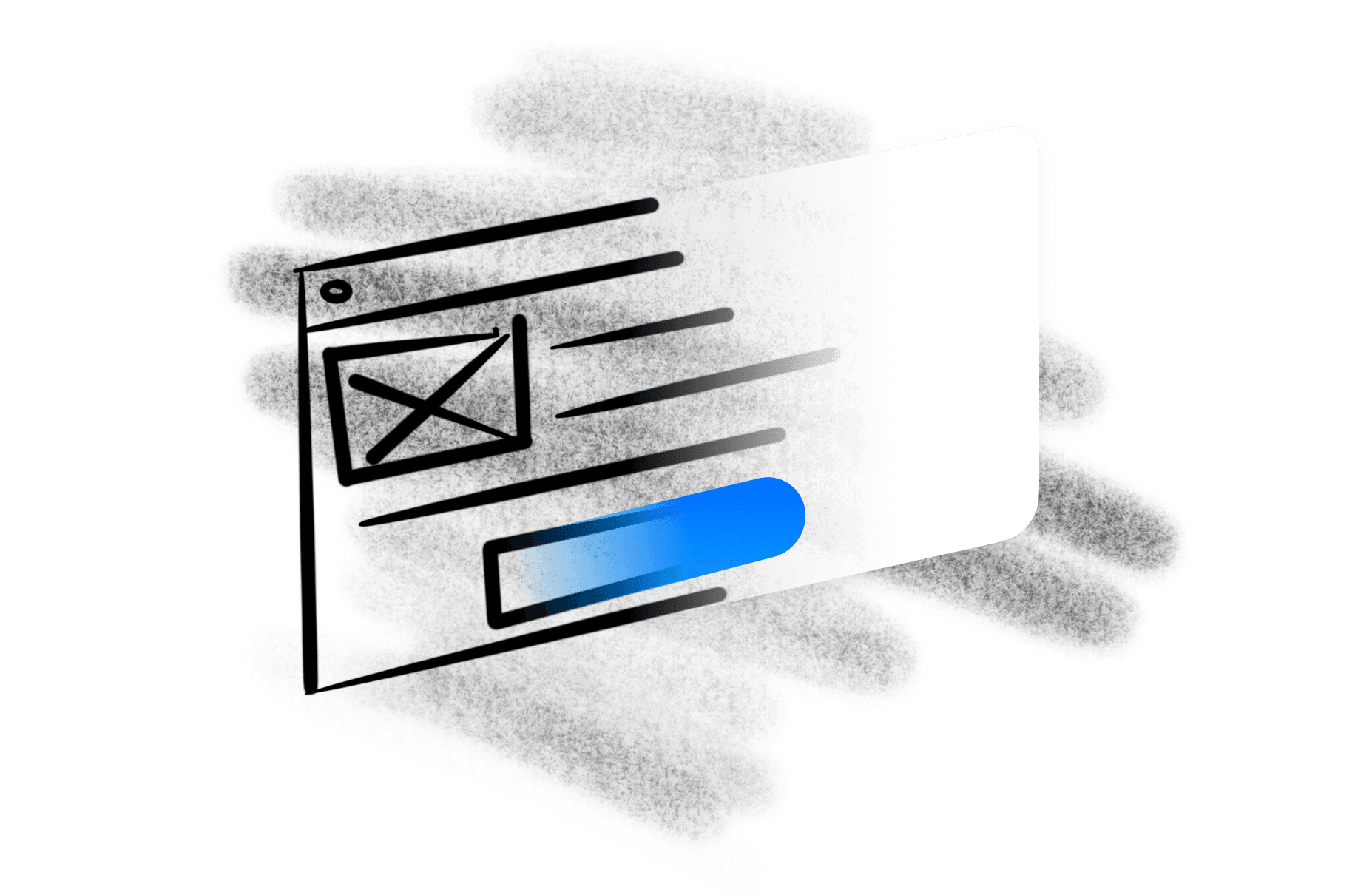
Whether it’s static mockup images of UI, or visual and interactive prototypes of an interface, our output is often confined to the graphics tools they started in.
With this in mind, when people ask “which design tool should I use?”, what I hear is “which design tool will take my work closest to the threshold of representing the real thing?”. Through this framing, it’s easier to see that… none of them really do.
One of the telltale signs that our output is incomplete is when we review work that’s “shipped”—designs that led to a product getting built and delivered to end-users. Often in these reviews, the work is presented in the design tool, rather than the real end result. When asked why, designers respond: “what was built ended up different than the designs.”
The reason these deltas exist between what we design and what gets built is that engineers run into what’s sometimes referred to as “edge cases”, but really just means scenarios or views not clearly accounted for in the designs. Engineers often have to use their best judgement to decide how to resolve for this case, or choose to spend time going back to the designer, potentially delaying an important product launch.
If no single tool can take our work close to the threshold of reality, what can we do to close the remaining distance? How can we ensure that what we design is what gets built? Or short of that, how can we incorporate constraints into our design that we’ll face when it comes to building?
Design by collage
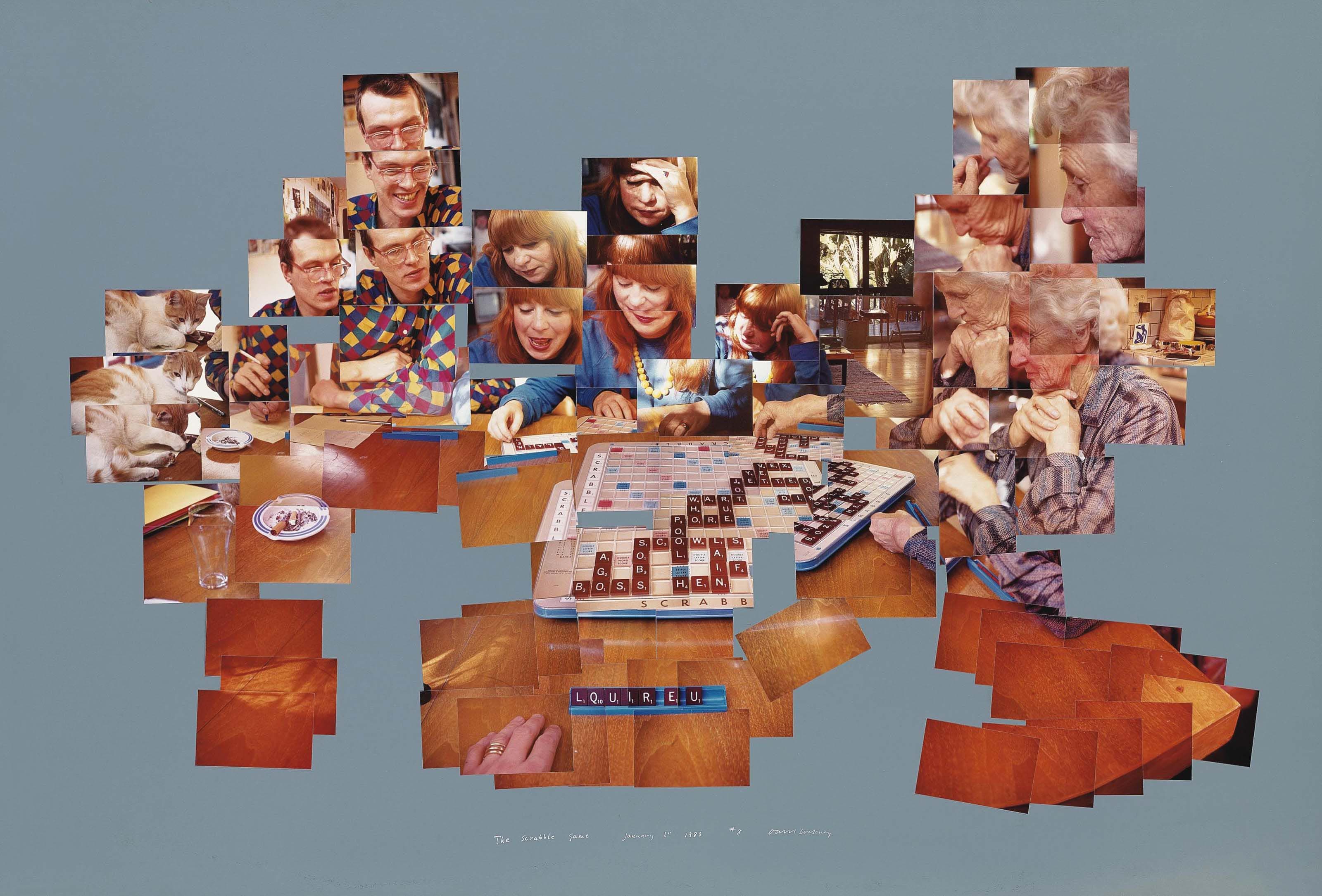
In the 1980’s, painter David Hockney began exploring a new medium—photography—though in a novel way. He created what he called “joiners”: collages of photographs taken during a relatively short period of time, showing a scene unfold over minutes, each individual photograph contributing a new perspective on the whole.
These collages make me think about the effectiveness of using a variety of design tools to provide a collage of design details. You might start with a wireframe sketch to begin a conversation about content or data requirements; then, you might provide high-fidelity mockups to garner buy-in from stakeholders. Further down the line, you might even dip into prototyping in code to show the nuances of an interaction to an engineer, or write an outline in a text document to explain the user flow.
All these pieces contribute to a richer, fuller picture of the intended end result. Short of building the product ourselves, the best thing we can do is provide as detailed an illustration of the most desirable outcome so that our design partners—engineers, product managers, content strategists, researchers, and more—can see as vividly as we can what the end goal is.
Another subtle benefit of this approach is that it better accommodates for those inevitable edge cases. By leaving the seams of our collage showing, it leaves more natural flexibility for engineers (or other contributors) to interpret for themselves how best to fill in the gaps. By not being as precious about the pixel-precision of the final output, we invite more people into the design process.
I doubt that any single design tool will ever bring us reliably into the realm of “production-ready” products. Even with the advent and advancement of “no-code” tools, declarative frameworks like SwiftUI, and advanced prototyping and collaborative design tools like Framer and Figma, there will always be obligations for designers and engineers to communicate around ambiguity. Whether it’s unforeseen internationalisation issues, accessibility considerations, or feature changes, if my experience is anything to go by, the best way to resolve these challenges is with a curious mind, a tapestry of tools, and an aspiration of “something like this”.