Design System Structure
“If you wish to make apple pie from scratch, you must first invent the universe.” —Carl Sagan
We’ve come a long way in this theoretical exploration of an atomic design system. The first step was discarding preconceived notions of a design library as a catalogue of ready-made components, and embracing instead the discrete properties that make up the components as the toolkit from which UI systems are built. But giving designers and engineers an atomic toolkit and leaving them to it is akin to asking them to create the universe when they just want to create a log in screen.
In the last post I wrote about design systems, I compared a possible approach for building atomic design systems to the book A Pattern Language, solidifying a framework for documenting compositions of “atoms” into components and patterns. This style of documenting the ready-made components reveals the atomic structure without burdening product teams with the challenge of figuring out their combinations. I concluded the post with a challenge, positing that most design systems already in existence share the vast majority of their patterns and components with one another, regardless of platform, audience, or context. I’d like to further clarify this notion and complete the picture of our theoretical system by introducing some structural domains.
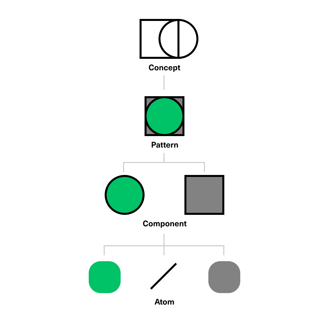
You can think of our system so far as a tree, with its most primitive elements at the bottom, comprising our atomic elements. These atoms—colors, spacing units, typography, and even dimensions of time, as in animations and transitions—are composed into components, and further composed to create patterns, which are common solutions to common problems.
But what lives beyond patterns? What properties dictate the patterns that we choose to lean on? There’s obvious overlap between, say, a button on one product and a button on another product, but how does one whittle down the multitude of available patterns across all contexts to only those relevant to the immediate context?

I’d like to introduce a top-level element of the tree of our design system; the concept. Think of the concept as the definition of the environment, audience, platform, and purpose of a system, with the ultimate goal of narrowing the relevant patterns and components available to only the sensible ones. For instance, in a 2D screen-based context like the web, we have few opportunities to use spatial cues, so we needn’t hold on to elements of the system—patterns and components—that are more suitable for VR, AR, or other three-dimensional environments.
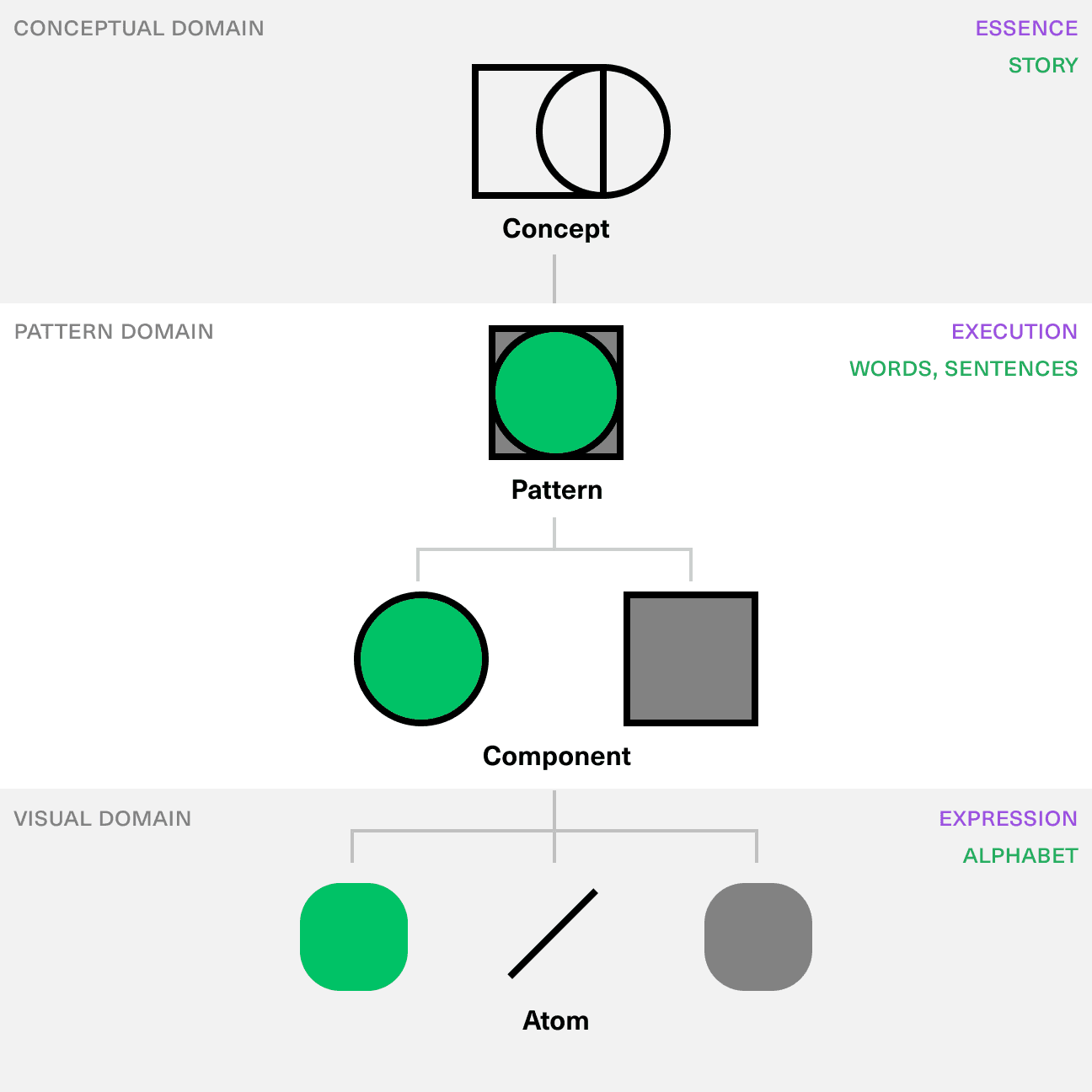
With the notion of a concept at the top of our tree, and that of atomic properties at the very bottom, we can see three rough divisions of the system.

The conceptual domain is the home of overarching principles. This domain describes the environment, audience, and overall purpose of a product, and it changes based on those variables. I also think of this as the “essence,” or in linguistic terms, the story.
The pattern domain is the fixed, middle piece. It describes the patterns and components that are utilized in order to make the story a reality. This can be thought of as the “execution,” or in linguistic terms, words and sentences. These elements stay roughly the same no matter what the concept is, but their frequency of use and degree of usefulness varies with different concepts. In other words, both a horror story and a nonfiction reference book may use the same language and terms, but to a different end.
The final domain is the visual domain, and like the conceptual domain, it changes between products, contexts, and platforms. It describes the primitive pieces that comprise the patterns and components—colors, text, and other “atomic” properties that make a brand or product distinct. This can be thought of as the “expression,” or in linguistic terms, the alphabet.
A system designed in this domain hierarchy may best be documented in plain writing, describing the Concept, Patterns, and Components in conceptual terms, agnostic of their surroundings. Using these descriptions of the system, the designer and engineer may draw their own conclusions about the comprising parts and their best implementation. This works well for the particular motivations of both roles: the designer is tasked with visually representing ideas and information using their available tools; the engineer is tasked with representing ideas and information through logical, mathematical, and modular transformations of data, using their available tools. In an ideal world, the solutions of the designer and the engineer converge and are ultimately the same, but today’s tools make this ideal difficult (though not impossible) to achieve.
This framework can be applied with ease to many design systems (digital or not) in existence, but new mediums present a challenge; what if the Concept we start with dictates we forget 100% of the patterns and components we are already familiar with? Take mediums such as Virtual Reality or voice-centric interfaces as examples. While in VR, paradigms like buttons may still be somewhat applicable, most other UI conventions are useless in contexts where spatial, auditory, or temporal cues constitute the majority of our available tools. In these cases, an expansion of the role of the Conceptual domain is in order, allowing more experimental exploration, and combined with an acceptance of ambiguity in the visual domain, one might successfully fill out and innovate in the pattern domain.
We may, in fact, learn more about our biases as designers through the lens of a new medium. What conventions do we too readily conjur as solutions to problems on mobile devices, in spite of the differences in environment and context? Only very recently have we seen products that use a more expressive and inventive range of technologies available in any smartphone, such as the camera or the device’s location, even though these capabilities have been available for years. More routinely forgetting convention might open new opportunities that are ordinarily hard to see.
This post is one in a loosely-connected series of posts about design systems and the teams that maintain them. Other installments include a framework for composing and documenting atomic systems, a conceptual view of how a design system ecosystem is maintained, and a theoretical exploration of compositional design systems.